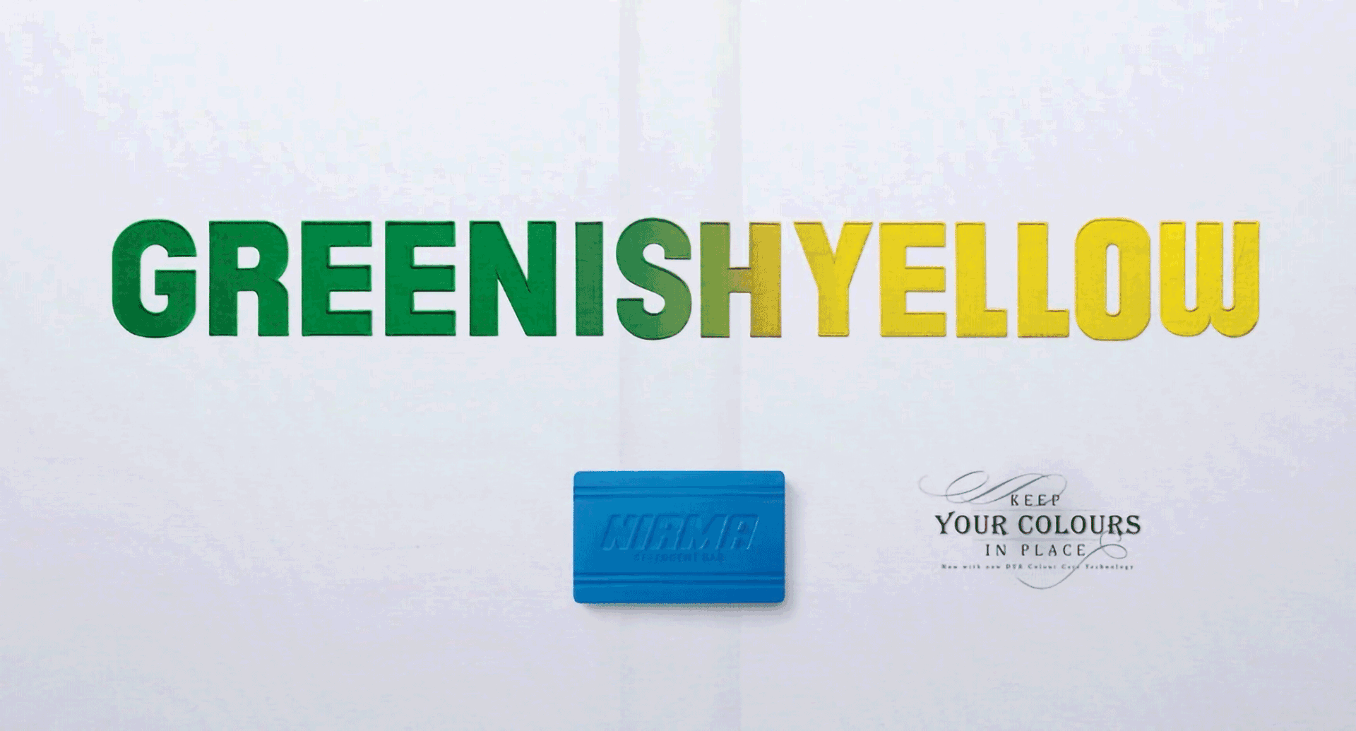
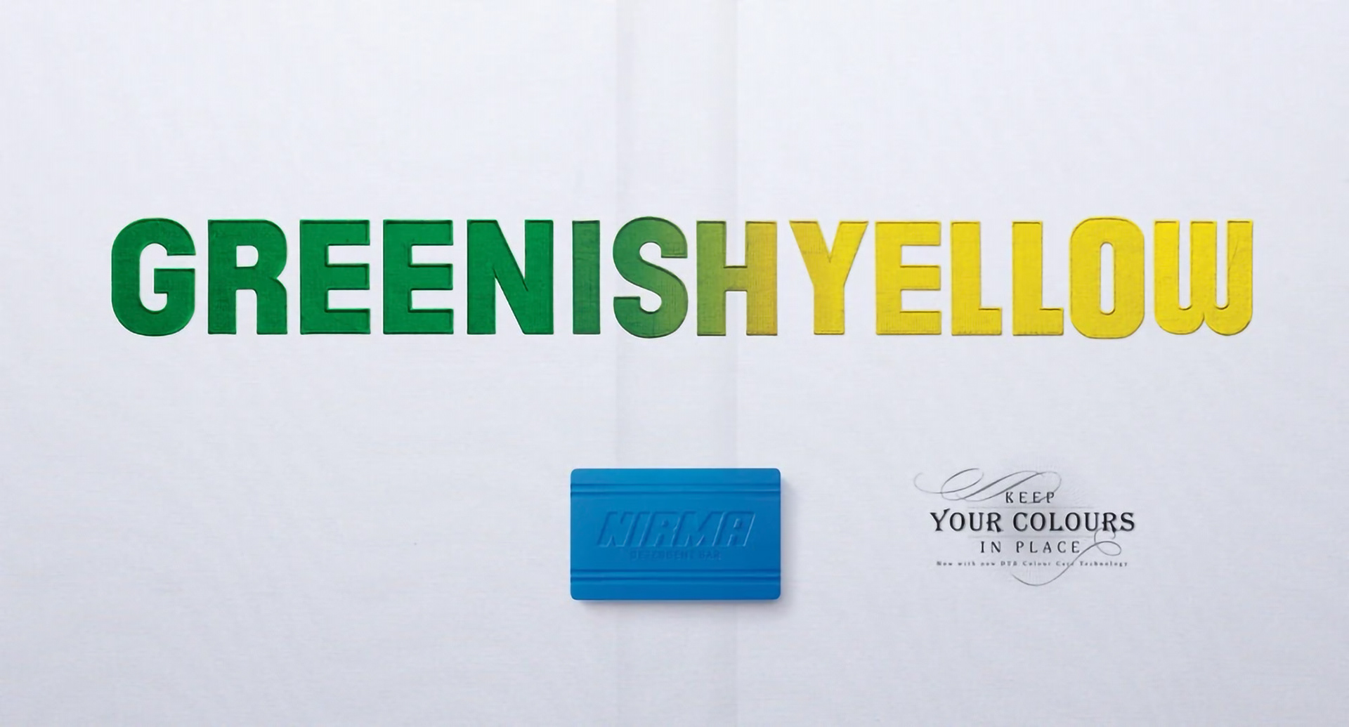
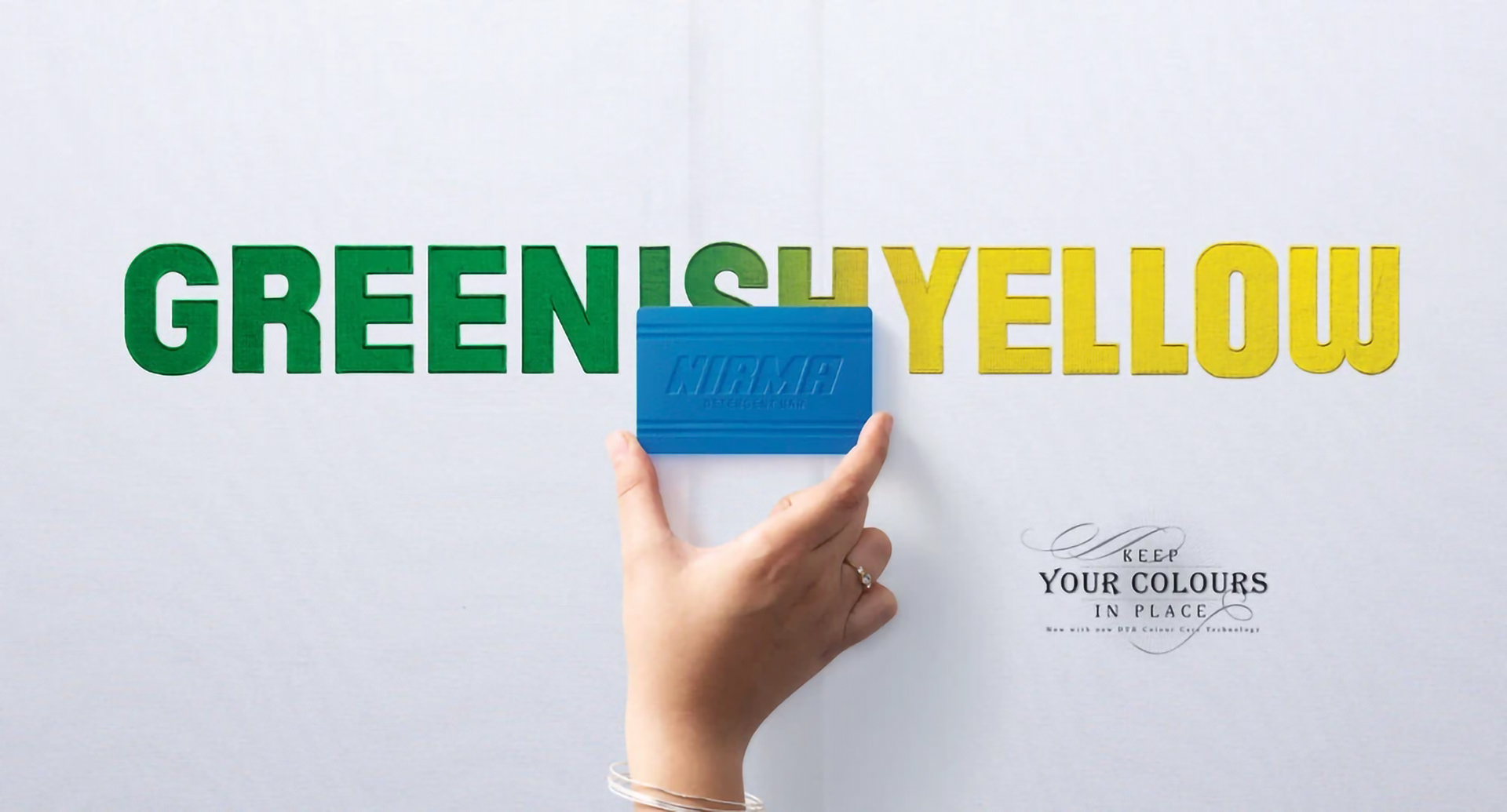
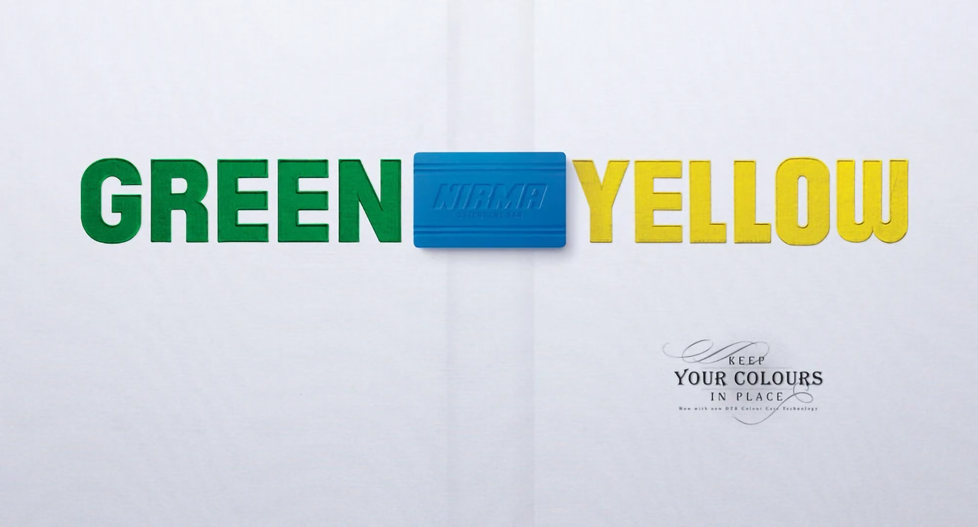
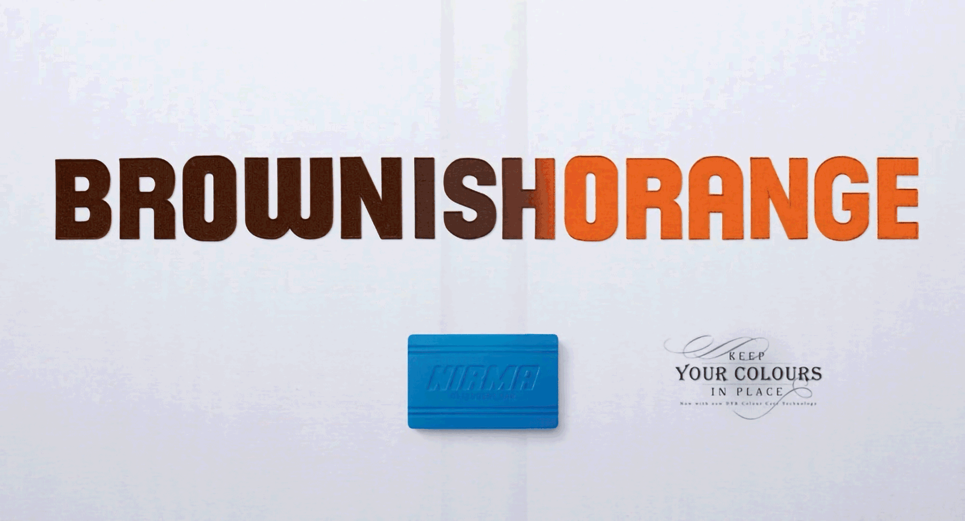
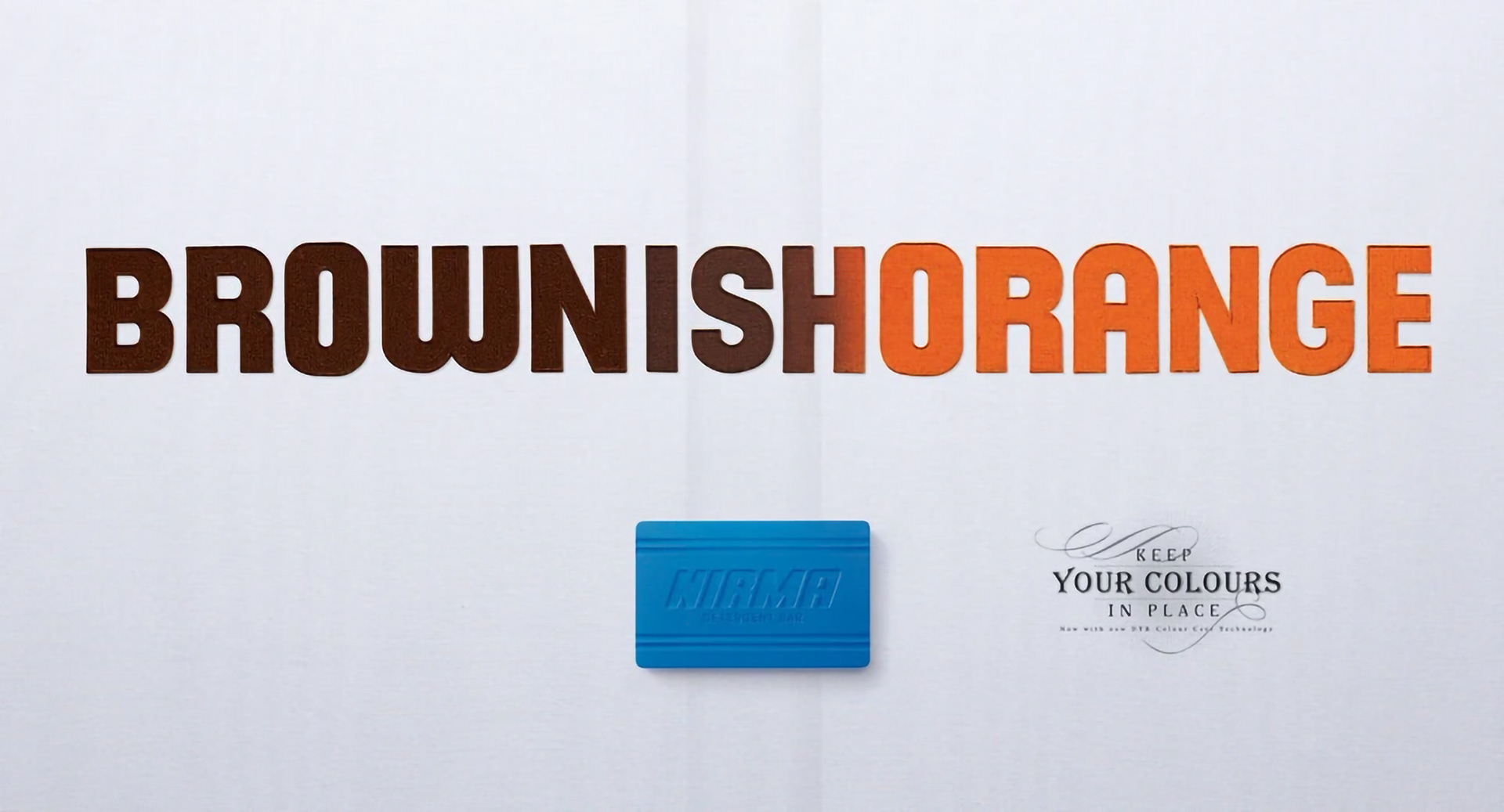
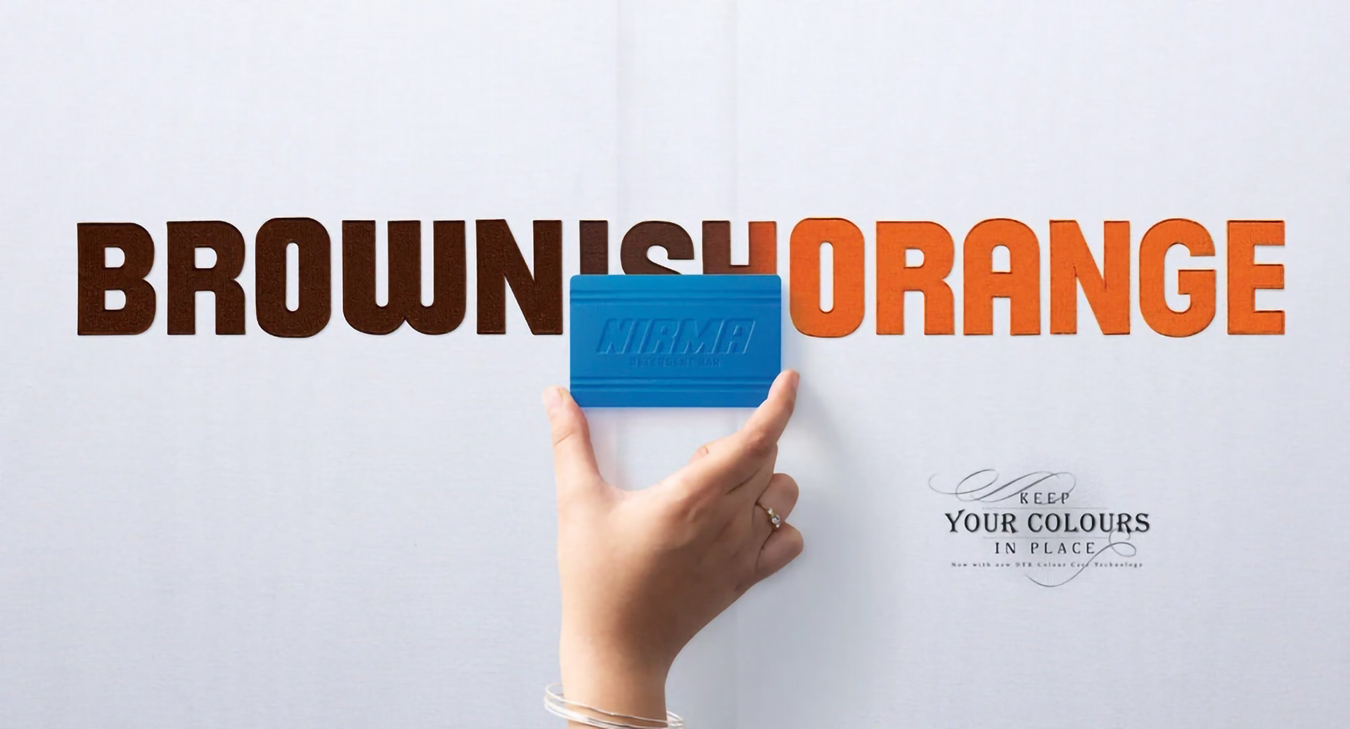
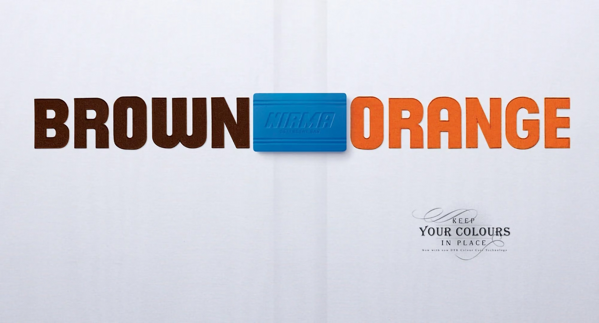
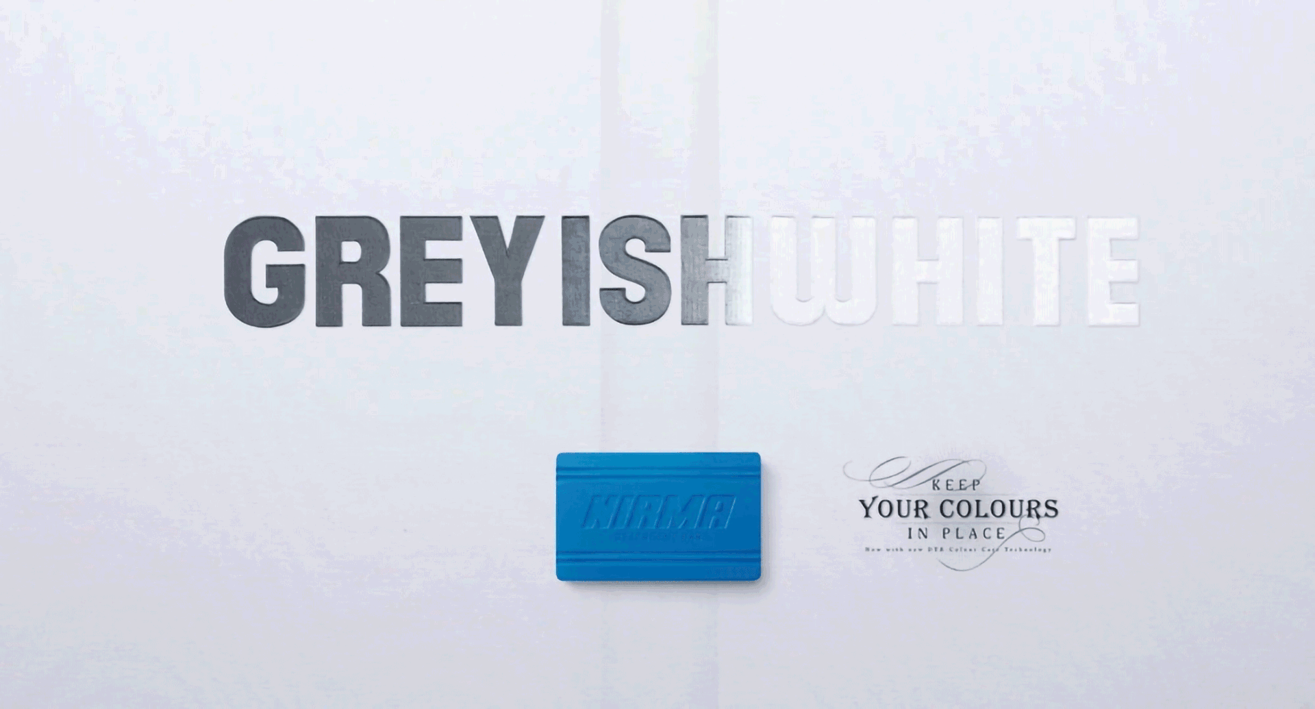
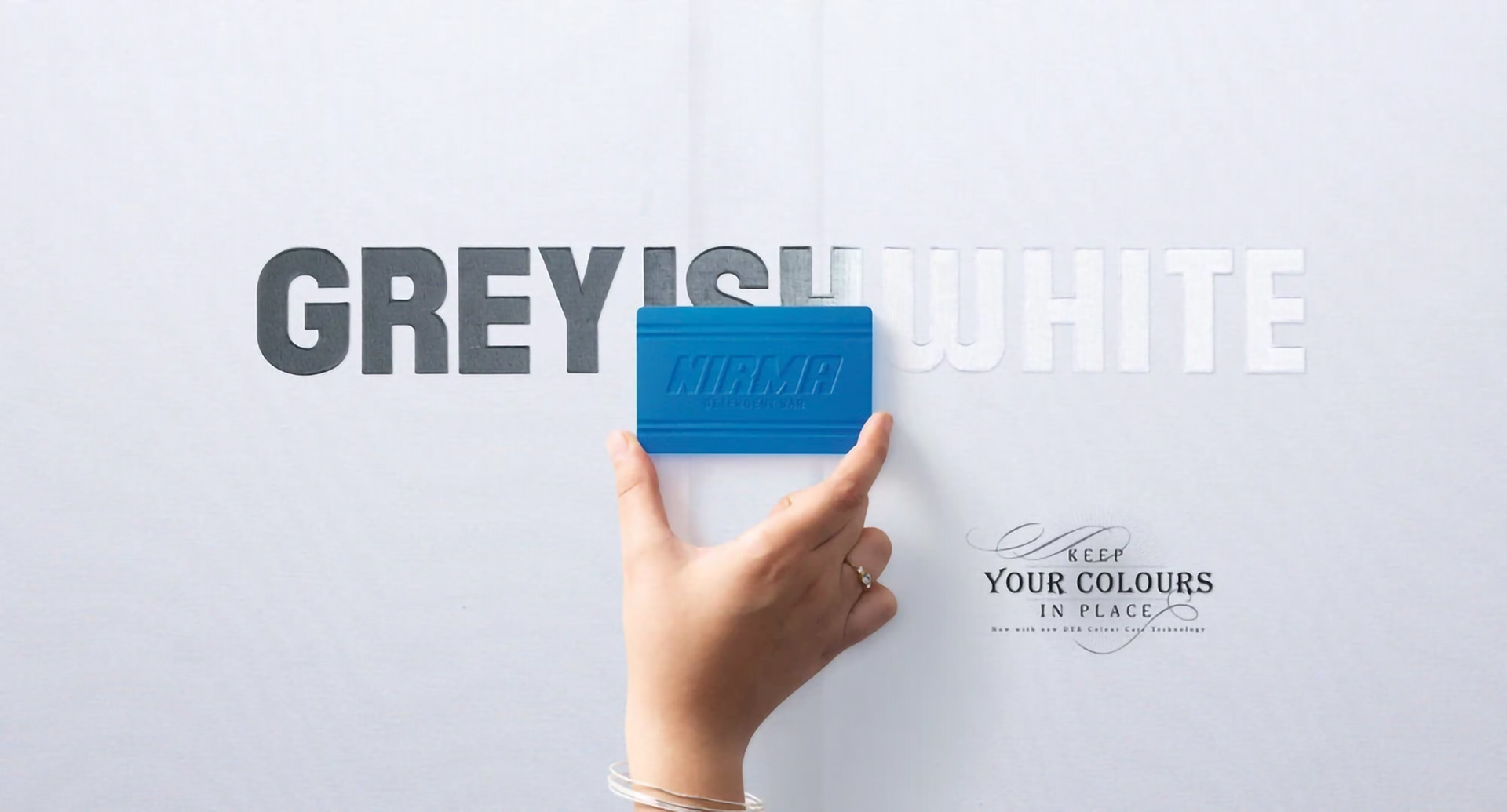
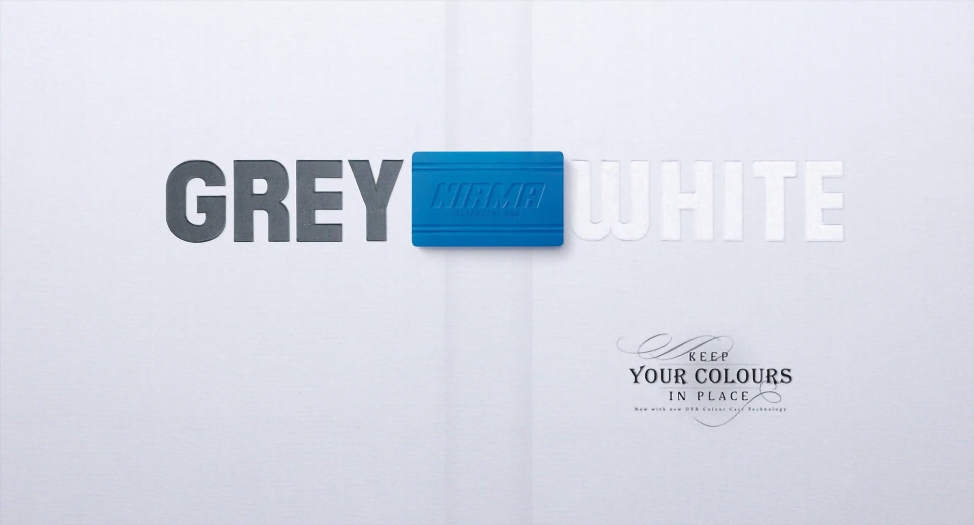
Created as an activation poster for Nirma Colour Guard Soap, this concept uses a simple visual interaction to demonstrate the product benefit in a tactile and memorable way. The poster begins with the words “Brown” and “Orange” placed apart, while a removable soap block physically bridges the gap between them. As the soap slides across, it reveals the hidden word “Brownish Orange” — symbolizing how colours bleed and mix during washing. The activation transforms the soap bar into both a storytelling device and a functional metaphor, reinforcing the product promise of preserving original colours. Minimal in execution yet highly interactive, the design relies on typography, movement, and participation to communicate the message instantly.